
More about Tangent
]]>
Silent letters, students from Copenhaguen Institute of Interaction Design bring us this fascinating data visualisation project.
]]>Principles of User Interface Design
“To design is much more than simply to assemble, to order, or even to edit; it is to add value and meaning, to illuminate, to simplify, to clarify, to modify, to dignify, to dramatize, to persuade, and perhaps even to amuse.” – Paul Rand
-
Interfaces exist to enable interaction
Interfaces exist to enable interaction between humans and our world. They can help clarify, illuminate, enable, show relationships, bring us together, pull us apart, manage our expectations, and give us access to services. The act of designing interfaces is not art and they are not monuments unto themselves. Interfaces do a job and their effectiveness can be measured. They are not just utilitarian, however. The best interfaces can inspire, evoke, mystify, and intensify our relationship with the world.
-
Clarity is job #1
Clarity is the first and most important job of any interface. To be effective using an interface you’ve designed, people must be able to recognize what it is, care about why they would use it, understand what the interface is helping them interact with, predict what will happen when they use it, and then successfully interact with it. While there is room for mystery and delayed gratification in interfaces, there is no room for confusion. Clarity inspires confidence and leads to further use. One hundred clear screens is preferable to a single cluttered one.
-
Conserve attention at all costs
We live in a world of interruption. It’s hard to read in peace anymore without something trying to distract us and direct our attention elsewhere. Attention is precious. Don’t litter the side of your applications with distractible material…remember why the screen exists in the first place. If someone is reading let them finish reading before showing that advertisement (if you must). Honor attention and not only will your readers be happier, your results will be better. When use is the primary goal, attention becomes the prerequisite. Conserve it at all costs.
-
Keep users in control
Humans are most comfortable when they feel in control of themselves and their environment. Thoughtless software takes away that comfort by forcing people into unplanned interactions, confusing pathways, and surprising outcomes. Keep users in control by regularly surfacing system status, by describing causation (if you do this that will happen) and by giving insight into what to expect at every turn. Don’t worry about stating the obvious…the obvious almost never is.
-
Direct manipulation is best
The best interface is none at all, when we are able to directly manipulate the physical objects in our world. Since this is not always possible, and objects are increasingly informational, we create interfaces to help us interact with them. It is easy to add more layers than necessary to an interface, creating overly-wrought buttons, chrome, graphics, options, preferences, windows, attachments, and other cruft so that we end up manipulating UI elements instead of what’s important. Instead, strive for that original goal of direct manipulation…design an interface with as little a footprint as possible, recognizing as much as possible natural human gestures. Ideally, the interface is so slight that the user has a feeling of direct manipulation with the object of their focus.
-
One primary action per screen
Every screen we design should support a single action of real value to the person using it. This makes it easier to learn, easier to use, and easier to add to or build on when necessary. Screens that support two or more primary actions become confusing quickly. Like a written article should have a single, strong thesis, every screen we design should support a single, strong action that is its raison d’etre.
-
Keep secondary actions secondary
Screens with a single primary action can have multiple secondary actions but they need to be kept secondary! The reason why your article exists isn’t so that people can share it on Twitter…it exists for people to read and understand it. Keep secondary actions secondary by making them lighter weight visually or shown after the primary action has been achieved.
-
Provide a natural next step
Very few interactions are meant to be the last, so thoughtfully design a next step for each interaction a person has with your interface. Anticipate what the next interaction should be and design to support it. Just as we like in human conversation, provide an opening for further interaction. Don’t leave a person hanging because they’ve done what you want them to do…give them a natural next step that helps them further achieve their goals.
-
Appearance follows behavior (aka form follows function)
Humans are most comfortable with things that behave the way we expect. Other people, animals, objects, software. When someone or something behaves consistently with our expectations we feel like we have a good relationship with it. To that end designed elements should look like how they behave. In practice this means that someone should be able to predict how an interface element will behave merely by looking at it. If it looks like a button it should act like a button. Don’t get cute with the basics of interaction…keep your creativity for higher order concerns.
-
Consistency matters
Following on the previous principle, screen elements should not appear consistent with each other unless they behave consistently with each other. Elements that behave the same should look the same. But it is just as important for unlike elements to appear unlike (be inconsistent) as it is for like elements to appear consistent. In an effort to be consistent novice designers often obscure important differences by using the same visual treatment (often to re-use code) when different visual treatment is appropriate.
-
Strong visual hierarchies work best
A strong visual hierarchy is achieved when there is a clear viewing order to the visual elements on a screen. That is, when users view the same items in the same order every time. Weak visual hierarchies give little clue about where to rest one’s gaze and end up feeling cluttered and confusing. In environments of great change it is hard to maintain a strong visual hierarchy because visual weight is relative: when everything is bold, nothing is bold. Should a single visually heavy element be added to a screen, the designer may need to reset the visual weight of all elements to once again achieve a strong hierarchy. Most people don’t notice visual hierarchy but it is one of the easiest ways to strengthen (or weaken) a design.
-
Smart organization reduces cognitive load
As John Maeda says in his book Simplicity, smart organization of screen elements can make the many appear as the few. This helps people understand your interface easier and more quickly, as you’ve illustrated the inherent relationships of content in your design. Group together like elements, show natural relationships by placement and orientation. By smartly organizing your content you make it less of a cognitive load on the user…who doesn’t have to think about how elements are related because you’ve done it for them. Don’t force the user to figure things out…show them by designing those relationships into your screens.
-
Highlight, don’t determine, with color
The color of physical things changes as light changes. In the full light of day we see a very different tree than one outlined against a sunset. As in the physical world, where color is a many-shaded thing, color should not determine much in an interface. It can help, be used for highlighting, be used to guide attention, but should not be the only differentiator of things. For long-reading or extended screen hours, use light or muted background colors, saving brighter hues for your accent colors. Of course there is a time for vibrant background colors as well, just be sure that it is appropriate for your audience.
-
Progressive disclosure
Show only what is necessary on each screen. If people are making a choice, show enough information to allow them the choice, then dive into details on a subsequent screen. Avoid the tendency to over-explain or show everything all at once. When possible, defer decisions to subsequent screens by progressively disclosing information as necessary. This will keep your interactions more clear.
-
Help people inline
In ideal interfaces, help is not necessary because the interface is learnable and usable. The step below this, reality, is one in which help is inline and contextual, available only when and where it is needed, hidden from view at all other times. Asking people to go to help and find an answer to their question puts the onus on them to know what they need. Instead build in help where it is needed…just make sure that it is out of the way of people who already know how to use your interface.
-
A crucial moment: the zero state
The first time experience with an interface is crucial, yet often overlooked by designers. In order to best help our users get up to speed with our designs, it is best to design for the zero state, the state in which nothing has yet occurred. This state shouldn’t be a blank canvas…it should provide direction and guidance for getting up to speed. Much of the friction of interaction is in that initial context…once people understand the rules they have a much higher likelihood of success.
-
Existing problems are most valuable
People seek out solutions to problems they already have, not potential problems or problems of the future. Therefore, resist creating interfaces for hypothetical problems, observe existing behavior and design to solve existing problems. This isn’t as exciting as blue sky wondering but can be much more rewarding as people will actually use your interface.
-
Great design is invisible
A curious property of great design is that it usually goes unnoticed by the people who use it. One reason for this is that if the design is successful the user can focus on their own goals and not the interface…when they complete their goal they are satisfied and do not need to reflect on the situation. As a designer this can be tough…as we receive less adulation when our designs are good. But great designers are content with a well-used design…and know that happy users are often silent.
-
Build on other design disciplines
Visual and graphic design, typography, copywriting, information architecture and visualization…all of these disciplines are part of interface design. They can be touched upon or specialized in. Do not look get into turf wars or look down on other disciplines: grab from them the aspects that help you do your work and push on. Pull in insights from seemingly unrelated disciplines as well…what can we learn from publishing, writing code, bookbinding, skateboarding, firefighting, karate?
-
Interfaces exist to be used
As in most design disciplines, interface design is successful when people are using what you’ve designed. Like a beautiful chair that is uncomfortable to sit in, design has failed when people choose not to use it. Therefore, interface design can be as much about creating an environment for use as it is creating an artifact worth using. It is not enough for an interface to satisfy the ego of its designer: it must be used!

See more on Wood castings, at Hilla Shamias Portfolio.


Rocking horse

More works at Hilla Shamias Portfolio.
]]>Das Design Revolution,
by Stuart Neale on 19.03.2012.
Experience design comrades, I speak to you today because I have a vision. A vision where one day the person who really matters is back at the heart of our design processes. Rightfully claiming pride of place at the centre of all decisions regarding our websites, interfaces and systems. I am talking, of course, of the Designer, or more specifically, the Designer’s Portfolio.
For too long have we pandered to the user-centered orthodoxy at the expense of beautiful 1,200px wide images crafted for CSSgallery websites. How can we be expected to turn a small corner into a 400×300px snapshot that looks good on Dribble.com whilst having to worry about user personas? How can we expect Patterntap.com to accept our gorgeous, beveled navigation system if we have to spend time considering things like reassurance, orientation or SEO?
We are forced by project teams to worry incessantly about requirements: the user’s, the business’s or even, heaven forbid, the client’s. Our KPIs continually push us to sacrifice our design flourishes at the alter of ‘simplicity’ or even ‘usability’, whilst paying no heed to fulfilling our fundamental needs as frustrated Fine Artists or Filmmakers.
So in response to this I propose a new way of thinking about our practice. A revolution if you will. Set your iPhone lamp to ‘on’ and let it illuminate the darkness of agile prototyping methodology toward a shining new revelation:
Portfolio-Centered Design
“I’m with you!” you tweet, “but how can we blindly follow you with no manifesto?”. Fear not; using my own process I have carefully crafted a ten-point system (because ‘ten-point’ always sounds best, regardless of how many cogent points I can actually come up with) for a designer to keep in mind. Consider these a checklist that will help you achieve the pinnacle of a shining portfolio, and get that all important job in an interactive marketing agency, turning above-the-line advertising into social media campaigns.
1. First and foremost, context is nothing
For a designer to have to think about a portfolio that is anything more than a series of images accessed by menus of thumbnails is absurd and not worthy of consideration. After all, if it’s good enough for art galleries then why not for us? We have to remember that our designs are essentially a series of pictures: to be looked at, commented on and copied in a suitably reverential setting.
Only this way can they truly ‘breathe’ as we want them to. Only then can we see their true aura, stripped of superfluous information, context or brief. Only then can they be evaluated without reference to requirements or KPIs, changing digital landscapes or touchscreen shapes and sizes.
2. Don’t pay too much attention to testing
How can users meaningfully assess your designs? They might have no prior knowledge of the system. Surely the best-placed person to decide if a series of pages works is the person who designed them. It’s obvious that only they really know what each item means and are best placed to understand the design decisions behind it.
Too often do I hear designers overruled with questions about users’ comprehension. Too often have I heard arguments citing Cognitive Psychology. Too often have principles of human behaviour and capabilities trumped good, solid layout decisions.
If the designer has seen the problem solved by their favourite app on their iPhone, which was approved by Apple, then it must be the best process and the users will eventually just learn how to use the system.
3. You can never arrive at a solution too quickly
If you can re-write a brief with as many solutions upfront as possible, this will significantly cut down on research, iterations, and those frustrating workshops with the wider team, clients or users. You are not a business consultant and this approach will free you up for the important jobs, like deciding which Smashing Magazine social icon set best reflects current design trends.
This also allows you to fill the gaps in your portfolio. Missing an AJAX carousel? Seen a good example of one? Simply set up the brief so the project needs a carousel (there has to be an explanation for them existing).
Finally, that portfolio needs a current, on-trend solution? Simply find yourself one (preferably popularised by industry gurus) and retro-fit the project requirements later. You can have these two for nothing: embedded fonts or responsive design (will work for about another six months or so).
4. Content is not your job
We cannot be expected to be storytellers; it is not our job to guide people through our sites. This is the job of the content strategist or copywriter and can be done right at the end. Taxonomy, nomenclature and so on, these are simply not as important as getting the colour pallet nailed.
There is a great tradition of using dummy Latin text in advertising. So why not stick to it? It makes us look like our fledgling field has roots in an older and more accepted field like advertising layout.
5. Considerations of technology – somebody else’s job
Do not collaborate with programmers. Keep as far away as possible, do not let them stifle creativity. Only the ‘Creative’ team is really qualified to come up with UX solutions; they’re the ones who went to Art College after all. Maintain a good ‘over-the-fence’ relationship with the technical or engineering team, and none of their prototyping or agile methodology will get in the way of your blue-sky design thinking. This leads us neatly to –
6. Collaboration, not exactly a dirty word, but a bit icky
Again, advertising can be our paradigm here. Silos keep things simple. Strategy is best left to the strategy team, user research and engagement to the IA team, and so on. Demand polished wireframes (think ‘scamps’) to colour in.
Client management? You know where the account team is. Keep your engagement to carefully planned walkthroughs, making sure the number of solutions to be presented is pre-arranged so there are no surprises. If in doubt, just remember headphones can be a designer’s best friend.
7. Accessibility works best as an afterthought
This is what the principle of ‘degrade gracefully’ was invented for. Always design for the highest spec users. This allows you total creative freedom, unencumbered by limitations of contrast, plug-ins, browsers, user’s disabilities and so forth. It is self-evident that only this can produce the most creative design solutions.
Then simply allow the site to ‘degrade gracefully’ and everyone who doesn’t sign up to your setup can simply enjoy an experience more suited to their system, or their personal limitations.
8. Photoshop: let that be where responsibility ends
If you can fill your folio with the initial designs, it ultimately doesn’t matter to you how it turned out in the browser, or whether KPIs were achieved. Sticking to your goal of beautiful pictures above all else allows you to keep your involvement ring-fenced to the early phase of the project and avoid the difficult responsibilities later on.
This keeps you free to make sure you always have your ear to the ground for the next portfolio-worthy project to work-up in Photoshop and get onto your site.
9. Lorem ipsum dolor sit amet
Don’t be afraid of filler content to fit a nice pre-existing pattern. As I said ‘ten-point plan’ sounds better than ‘nine-point plan’. Whether the site experience works as a flow over multiple pages is not evident from portfolio grabs, so don’t worry, you are safe.
10. Don’t throw your net too wide
You’re crafting visual designs, so restrict your influences to that field. You can’t be expected to have time to absorb other mediums, have other interests or think about how they could relate to the problems we are trying to solve.
Your influences should come from within digital and possibly graphic design. What can film or games design teach you? Architecture is about buildings not websites. They are fundamentally different disciplines and will only confuse the design purity. Remember: “if it’s not Swiss, give it a miss.”
Keep all these in mind, and that award-winning portfolio could be yours!
Just don’t send it to me, that’s all I ask.
…………………………………………………………………………………………………………………………………
Just in case, for those who by chance didn’t manage to cacht it…, this post is a humorous satire.
]]>


“…before we worked together, he was a legend in my eyes. His designs, for film titles and company logos and record albums and posters, defined an era.”
MARTIN SCORSESE
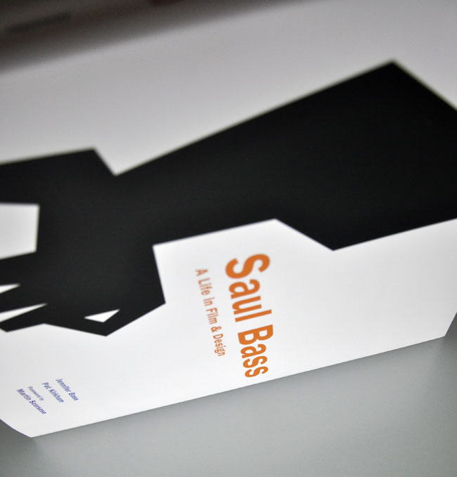
Saul Bass: A Life in Film & Design is the first book to be dedicated to one of the greatest American designers of the twentieth century. Produced by Jennifer Bass Saul’s daughter and Pat Kirkham, and published by Laurence King, it’s a gem.
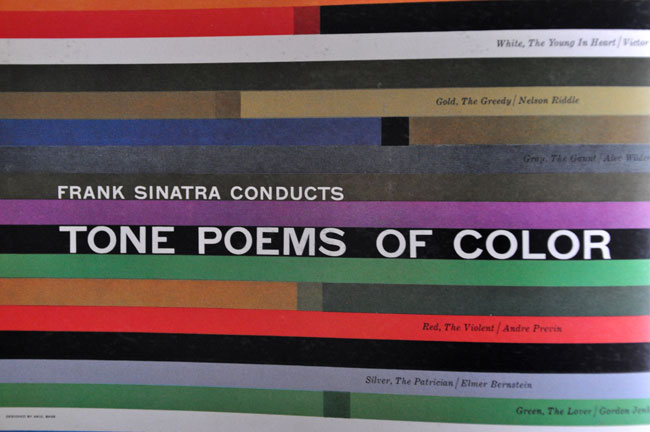
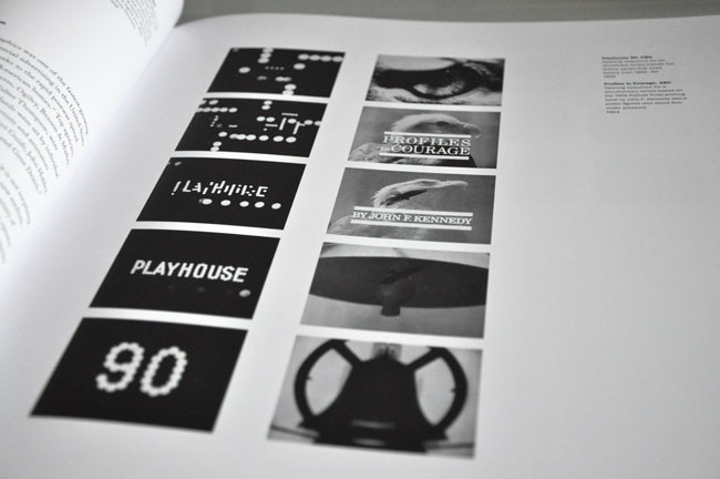
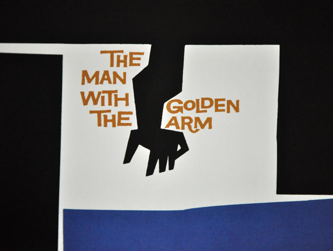
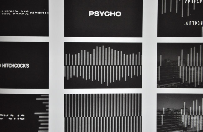
Saul Bass 1920-1996 created some of the most compelling images of American postwar visual culture. Having extended the remit of graphic design to include film titles, he went on to transform the genre. His best-known works include a series of unforgettable posters and title sequences for films such as Alfred Hitchcock’s Vertigo and Otto Preminger’s The Man with the Golden Arm and Anatomy of a Murder. He also created some of the most memorable logos and corporate identity campaigns of the century, including those for major companies such as AT&T, Quaker Oats, United Airlines, and Minolta.
Saul Bass: A Life in Film & Design from Laurence King Publishing on Vimeo.
Reblogged from Saul Bass: A Life in Film & Design | David Airey, graphic designer.
]]>


]]>“A post-industrial Rococo master, Kris Kuksi obsessively arranges characters and architecture in asymmetric compositions with an exquisite sense of drama. Instead of stones and shells he uses screaming plastic soldiers, miniature engine blocks, towering spires and assorted debris to form his landscapes.
The political, spiritual and material conflict within these shrines is enacted under the calm gaze of remote deities and august statuary. Kuksi manages to evoke, at once, a sanctum and a mausoleum for our suffocated spirit.”