July 25, 2012
by Paco
0 comments

July 25, 2012
by Paco
0 comments
June 26, 2012
by Paco
0 comments
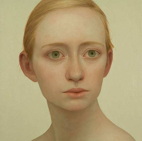


Lu Cong was born in Shanghai, in February 1978. He immigrated to the United States in 1989 at the age of 11. After graduating from the University of Iowa with degrees in Biology and Art in 2000, Lu chose to pursue portrait art over medicine. Lu has developed a distinctive look that many has regarded as an original approach to figurative realism. His portraits do not simply capture the physical or emotional likeness of the subject, rather they beckon to establish an authentic engagement – interaction that ensues when one comes face to face with the sensual, the inexplicable, and the unsettling.
June 13, 2012
by Paco
0 comments
June 7, 2012
by Paco
0 comments
The world is a bit more alone.
Buen viaje a otros mundos, maestro.
RIP, Ray Bradbury (1920-2012).
via Ray Bradbury Gives 12 Pieces of Writing Advice to Young Authors 2001 | Open Culture.
June 5, 2012
by Paco
0 comments
Reblogged. Via A separate mobile website: no forking way | Opinion | .net magazine.
The experience of using a mobile website should naturally be different from a desktop experience – not just visual presentation, content should be prioritised and structured differently. The risk, though, is that you’ll wind up maintaining different versions. News flash: this will be a disaster. Duplicate content. Out-of-sync updates. Wasted effort.
When usability pioneer Jakob Nielsen argued that you should “Build a separate mobile-optimised site (or mobile site) if you can afford it” where you cut features and content “that are not core to the mobile use case”, many within the mobile design and development community got out their torches and pitchforks. Seems like people who spend a lot of time thinking about mobile agree that a separate mobile website is “180-degrees backward”.
But what does a “separate mobile website” even mean?
Whether you’re talking about content or code, what you want to guard against is creating multiple versions of your website. It’s called forking, and it’s a forking nightmare from a maintenance perspective. If you fork your website into separate mobile and desktop versions, then you’re stuck updating both of them every time there’s a change. Avoiding this problem is tricky, even with sophisticated content management systems. But before we get there, let’s start with a simple scenario.
Imagine you have a static website that you created back in the late 90s. There’s no CMS, so all the content is hard-coded into your HTML.
You decide that you want to join the 21st century by creating a mobile website. Good for you! Except for the nightmare part, which is that you’ll essentially be creating a totally separate website, and now you’ll have to update both versions every time there’s a change. You’ll need to code two completely different sets of pages: unique templates for both desktop and mobile. And even if – especially if – you want to publish exactly the same content to both versions, you’ll have to maintain two separate versions of the content too. Double your workload, double your fun?
Great! You might think. Maybe creating distinct content is actually an advantage! A separate mobile website will still be aces if I don’t want to publish exactly the same information. I’ll cut features, cut content, and re-prioritise what I want to say. I’ll publish a mobile website that only shows a subset of my content, targeted specifically at the needs of the mobile user.
Let’s set aside for a moment the argument about whether or not that’s the right user experience. (It’s not.)
From a maintenance perspective, you’re still forking your content. Want to add a new page? Edit a description? Fix a typo? You’ll be doing it twice.
The whole point of having a content management system is to help streamline the publishing workflow, right? So of course, you just assume that your current CMS will make it easy to publish content to different channels and platforms.
Jakob Nielsen makes this assumption when asked about the dangers of forking your content:
“I would assume that most industrial-scale sites would be generated from a single backend product database and content management system, with the different designs represented by templates and rules about what information goes into what version.”
Unfortunately, today, many CMSes just don’t support this type of multi-channel publishing. Ask your CMS to display similar-but-not-the-same content in different templates according to a set of business rules, and it’ll start spewing out yards of dot-matrix printer paper, beeping that it “does not compute.”
Most CMSes are designed to publish to one and only one platform: the desktop web. In a Web CMS (WCMS), content authoring and management functions are “coupled” with content publishing and display functions. (If you have a large-scale enterprise CMS, it’s likely “de-coupled” and this point may not apply to you.)
Most websites simply don’t have a content management backend that will support populating different design templates with different content. Content assets (like text fields, images, and supporting files or media) are usually locked to a specific output format or design. That wasn’t a problem until now, because no one expected the WCMS to have to support publishing to different channels – the desktop web was all there was.
The fact that the WCMS works this way is no mere “implementation detail.” Unfortunately, it’s fundamental to the way content is published on the web today. We’ve got to fix this if we’re going to deliver optimised experiences on desktop and mobile.
Now, some CMSes do, in fact, support publishing content to multiple templates. It’s called multi-site management, and it’s what allows a WordPress blog or a Drupal site to have separate templates for desktop and mobile content display. Note that says “separate templates”– not separate content. These CMSes still like to publish the same content on both sites. (Specifically, they’re happy when publishing the same “body” or “node” content one-to-one across desktop and mobile. Other content elements, like sidebars or user comments, are often stored in a different location and may be stripped out.)
What these CMSes don’t do (at least not without putting significant effort into it) is support publishing different content to different templates according to a set of business rules. So if your plan is to deliver less content to your mobile user, chances are your CMS isn’t going to make that easy on you. You’re still going to have to maintain two versions of that content, and update them separately whenever there’s a change.
In other words, you’re forked.
Responsive design is often held up as a solution that saves you from having to maintain multiple separate codebases for your front-end code. Put the effort in to developing one set of code that will adapt to different screen sizes and progressively enhance for different device capabilities, and you’ll save time in the long run. You’ll also get out of the arms race of having to support dozens of different devices and form factors.
Responsive design is also an approach that saves you from forking your content. If you have a coupled CMS that can only handle publishing to one set of templates, then you can trick your CMS into publishing to different devices by handling the conversion to mobile or tablet sizes on the frontend.
The decision about whether to develop a responsively designed site or to maintain different templates for desktop, phone, and everything in-between is a pragmatic choice based on how you want to allocate time and resources for development and maintenance. There are good reasons for both approaches – often rooted in the specifics of how your CMS functions – and what works for one organisation may not work for another.
Let’s not get distracted by this debate and lose sight of the fundamental issue, which is how we evolve our content management tools and processes to effectively support multi-channel publishing.
The hype and the debates around responsive design are missing the real problem. The challenge for most organisations in the long run won’t be maintaining multiple sets of frontend code for different templates. It will be maintaining variations of duplicate content.
Any arguments about whether to deliver less content or different content to the mobile user need to take into account the level of effort that will be required to manage and maintain that content. If you’re going around suggesting that it’s okay to cut information provided to mobile users, be aware that this approach may doom you to duplicate content and governance headaches. Paying attention to this is the very essence of content strategy.
To provide a great experience on mobile – one that delivers the information users want, and can be maintained internally – we need a content strategy for mobile.
Via A separate mobile website: no forking way | Opinion | .net magazine.
June 5, 2012
by Paco
0 comments
Principles of User Interface Design.
“To design is much more than simply to assemble, to order, or even to edit; it is to add value and meaning, to illuminate, to simplify, to clarify, to modify, to dignify, to dramatize, to persuade, and perhaps even to amuse.” – Paul Rand
Interfaces exist to enable interaction between humans and our world. They can help clarify, illuminate, enable, show relationships, bring us together, pull us apart, manage our expectations, and give us access to services. The act of designing interfaces is not art and they are not monuments unto themselves. Interfaces do a job and their effectiveness can be measured. They are not just utilitarian, however. The best interfaces can inspire, evoke, mystify, and intensify our relationship with the world.
Clarity is the first and most important job of any interface. To be effective using an interface you’ve designed, people must be able to recognize what it is, care about why they would use it, understand what the interface is helping them interact with, predict what will happen when they use it, and then successfully interact with it. While there is room for mystery and delayed gratification in interfaces, there is no room for confusion. Clarity inspires confidence and leads to further use. One hundred clear screens is preferable to a single cluttered one.
We live in a world of interruption. It’s hard to read in peace anymore without something trying to distract us and direct our attention elsewhere. Attention is precious. Don’t litter the side of your applications with distractible material…remember why the screen exists in the first place. If someone is reading let them finish reading before showing that advertisement (if you must). Honor attention and not only will your readers be happier, your results will be better. When use is the primary goal, attention becomes the prerequisite. Conserve it at all costs.
Humans are most comfortable when they feel in control of themselves and their environment. Thoughtless software takes away that comfort by forcing people into unplanned interactions, confusing pathways, and surprising outcomes. Keep users in control by regularly surfacing system status, by describing causation (if you do this that will happen) and by giving insight into what to expect at every turn. Don’t worry about stating the obvious…the obvious almost never is.
The best interface is none at all, when we are able to directly manipulate the physical objects in our world. Since this is not always possible, and objects are increasingly informational, we create interfaces to help us interact with them. It is easy to add more layers than necessary to an interface, creating overly-wrought buttons, chrome, graphics, options, preferences, windows, attachments, and other cruft so that we end up manipulating UI elements instead of what’s important. Instead, strive for that original goal of direct manipulation…design an interface with as little a footprint as possible, recognizing as much as possible natural human gestures. Ideally, the interface is so slight that the user has a feeling of direct manipulation with the object of their focus.
Every screen we design should support a single action of real value to the person using it. This makes it easier to learn, easier to use, and easier to add to or build on when necessary. Screens that support two or more primary actions become confusing quickly. Like a written article should have a single, strong thesis, every screen we design should support a single, strong action that is its raison d’etre.
Screens with a single primary action can have multiple secondary actions but they need to be kept secondary! The reason why your article exists isn’t so that people can share it on Twitter…it exists for people to read and understand it. Keep secondary actions secondary by making them lighter weight visually or shown after the primary action has been achieved.
Very few interactions are meant to be the last, so thoughtfully design a next step for each interaction a person has with your interface. Anticipate what the next interaction should be and design to support it. Just as we like in human conversation, provide an opening for further interaction. Don’t leave a person hanging because they’ve done what you want them to do…give them a natural next step that helps them further achieve their goals.
Humans are most comfortable with things that behave the way we expect. Other people, animals, objects, software. When someone or something behaves consistently with our expectations we feel like we have a good relationship with it. To that end designed elements should look like how they behave. In practice this means that someone should be able to predict how an interface element will behave merely by looking at it. If it looks like a button it should act like a button. Don’t get cute with the basics of interaction…keep your creativity for higher order concerns.
Following on the previous principle, screen elements should not appear consistent with each other unless they behave consistently with each other. Elements that behave the same should look the same. But it is just as important for unlike elements to appear unlike (be inconsistent) as it is for like elements to appear consistent. In an effort to be consistent novice designers often obscure important differences by using the same visual treatment (often to re-use code) when different visual treatment is appropriate.
A strong visual hierarchy is achieved when there is a clear viewing order to the visual elements on a screen. That is, when users view the same items in the same order every time. Weak visual hierarchies give little clue about where to rest one’s gaze and end up feeling cluttered and confusing. In environments of great change it is hard to maintain a strong visual hierarchy because visual weight is relative: when everything is bold, nothing is bold. Should a single visually heavy element be added to a screen, the designer may need to reset the visual weight of all elements to once again achieve a strong hierarchy. Most people don’t notice visual hierarchy but it is one of the easiest ways to strengthen (or weaken) a design.
As John Maeda says in his book Simplicity, smart organization of screen elements can make the many appear as the few. This helps people understand your interface easier and more quickly, as you’ve illustrated the inherent relationships of content in your design. Group together like elements, show natural relationships by placement and orientation. By smartly organizing your content you make it less of a cognitive load on the user…who doesn’t have to think about how elements are related because you’ve done it for them. Don’t force the user to figure things out…show them by designing those relationships into your screens.
The color of physical things changes as light changes. In the full light of day we see a very different tree than one outlined against a sunset. As in the physical world, where color is a many-shaded thing, color should not determine much in an interface. It can help, be used for highlighting, be used to guide attention, but should not be the only differentiator of things. For long-reading or extended screen hours, use light or muted background colors, saving brighter hues for your accent colors. Of course there is a time for vibrant background colors as well, just be sure that it is appropriate for your audience.
Show only what is necessary on each screen. If people are making a choice, show enough information to allow them the choice, then dive into details on a subsequent screen. Avoid the tendency to over-explain or show everything all at once. When possible, defer decisions to subsequent screens by progressively disclosing information as necessary. This will keep your interactions more clear.
In ideal interfaces, help is not necessary because the interface is learnable and usable. The step below this, reality, is one in which help is inline and contextual, available only when and where it is needed, hidden from view at all other times. Asking people to go to help and find an answer to their question puts the onus on them to know what they need. Instead build in help where it is needed…just make sure that it is out of the way of people who already know how to use your interface.
The first time experience with an interface is crucial, yet often overlooked by designers. In order to best help our users get up to speed with our designs, it is best to design for the zero state, the state in which nothing has yet occurred. This state shouldn’t be a blank canvas…it should provide direction and guidance for getting up to speed. Much of the friction of interaction is in that initial context…once people understand the rules they have a much higher likelihood of success.
People seek out solutions to problems they already have, not potential problems or problems of the future. Therefore, resist creating interfaces for hypothetical problems, observe existing behavior and design to solve existing problems. This isn’t as exciting as blue sky wondering but can be much more rewarding as people will actually use your interface.
A curious property of great design is that it usually goes unnoticed by the people who use it. One reason for this is that if the design is successful the user can focus on their own goals and not the interface…when they complete their goal they are satisfied and do not need to reflect on the situation. As a designer this can be tough…as we receive less adulation when our designs are good. But great designers are content with a well-used design…and know that happy users are often silent.
Visual and graphic design, typography, copywriting, information architecture and visualization…all of these disciplines are part of interface design. They can be touched upon or specialized in. Do not look get into turf wars or look down on other disciplines: grab from them the aspects that help you do your work and push on. Pull in insights from seemingly unrelated disciplines as well…what can we learn from publishing, writing code, bookbinding, skateboarding, firefighting, karate?
As in most design disciplines, interface design is successful when people are using what you’ve designed. Like a beautiful chair that is uncomfortable to sit in, design has failed when people choose not to use it. Therefore, interface design can be as much about creating an environment for use as it is creating an artifact worth using. It is not enough for an interface to satisfy the ego of its designer: it must be used!
June 5, 2012
by Paco
0 comments
May 29, 2012
by Paco
0 comments
May 28, 2012
by Paco
0 comments
May 25, 2012
by Paco
0 comments
Ryoji Ikeda
born in 1966 in Gifu, Japan
live and work in Paris, France
Japan’s leading electronic composer and visual artist Ryoji Ikeda focuses on the essential characteristics of sound itself and that of visuals as light by means of both mathematical precision and mathematical aesthetics. Ikeda has gained a reputation as one of the few international artists working convincingly across both visual and sonic media. He elaborately orchestrates sound, visuals, materials, physical phenomena and mathematical notions into immersive live performances and installations.


More about ryoji ikeda | datamatics.


