Luminiferous

May 24, 2012
by Paco
0 comments

Hack the Cover, by Craig Mod

Magnificent essay reblogged from Hack the Cover — by Craig Mod.
Excerpt

……………………………………………………………………………………………………..
Hack the Cover
Covers, covers — everywhere
Muerto!
The covers are dead!
Dead!
Dead like the record jacket!

Dead like the laser disc sleeve!

Dead like the 8-track cartridge sticker!

Dead like the squishy Disney VHS container!

Dead like the cassette case inserts!

Dead like those damned CD jewel cases and their booklets!

Dead like DVD and Blue-ray box art!

Put ’em all in a box, burn ’em, and sprinkle their ashes over your razed local bookstore. Call it a day. Hang up your exact-o knifes and weld shut your drawers of metal type. The writing’s not on the wall but it was on one of those covers you just lit on fire — so we’ll never know what it said.

Next!

OK — phew. Still here? Great.

If digital covers as we know them are so ‘dead,’ why do we hold them so gingerly? Treat them like print covers? We can’t hurt them. They’re dead. So let’s start hacking. Pull them apart, cut them into bits and see what we come up with.

This is an essay for book lovers and designers curious about where the cover has been, where it’s going, and what the ethos of covers means for digital book design. It’s for those of us dissatisfied with thoughtlessly transferring print assets to digital and closing our eyes.

The cover as we know it really is — gasp — ‘dead.’ But it’s dead because the way we touch digital books is different than the way we touch physical books. And once you acknowledge that, useful corollaries emerge.

Leather-bound

Paula Fox writes in her memoir, The Coldest Winter: “I touched his signature as though it had been his face.”1 It’s this kind of intimacy with which we touch physical books, too.

And so we don’t want the cover to disappear. And yet the cover as we have known it is disappearing, rather quickly (nearly eradicated on hardware Kindles). This doesn’t mean it won’t be replaced. Whatever it’s replaced with, however, will not serve the same purpose as the covers with which we’ve grown up.

This romanticism is curious, if only because the cover of whose loss we lament is a recent invention. Matthew Battles writes in his book, Library: An Unquiet History:

“The people who shelve the books in Widener talk about the library’s breathing—at the start of the term, the stacks exhale books in great swirling clouds; at end of term, the library inhales, and the books fly back.”2

I can’t help but imagine all these flying books as leather bound. Thick, dusty, uniform and effectively ‘coverless’ by modern standards. Place them face-up on a table and they look identical: shielded and important but also anonymous. Only the scuffs and wear in the leather tell a story. And that story doesn’t say much about what’s inside.

Here, the cover is a protector of the signatures and the binding. It allows the books to fly in and out of the stacks a thousand times, and still be usable. In the digital world, our books are protected by ubiquity. They are everywhere and nowhere. They multiply effortlessly and can fly continuously without damage or rot. They don’t need covers like printed book need covers.

Kinokuniya & Delight

My awareness and relationship with covers began nearly a decade ago.

I was nineteen when I walked into Kinokuniya on the east side of Shinjuku station. At the time I knew nothing about Japan or making books. It was my first visit to a Japanese bookstore and, like most of my experiences then with things Japanese, I was amused, full of curiosity, and inspired. The place was bathed in a typically drab and corporate Japanese fluorescence, but drabness be damned, I distinctly recall the delight felt from picking up books at random. They were all so … rational.3


Hara Kenya, Designing Design

Kenya Hara, Designing Design


It wouldn’t be until years later that I realized this sense of rationality stemmed from a respect for readers. The books were sized perfectly for your back pocket or bag. Giant volumes were split into smaller tomes. The paper was elegant. The binding strong. Bookmarks glued in. But looking back, I was struck most of all by the austere covers. Little Hara Kenyas everywhere. Expanses of whitespace splashed with well considered marks of ink. One color. Restrained photography. Pretty books. Lots of ’em.4


There were racks of these minimal bricks. In fact, the vast majority fell under this careful aesthetic. In aggregate, this aesthetic formed a unified cultural voice. A rational system. The impact of this experience has stuck with me this past decade and deeply informed all of my design work. I continually ask myself: “How does one develop a design language or ecosystem that tempers itself? That somehow keeps from spiraling out of control?”

Seeing this shed new light on book covers in the west. In contrast, the shelves of our bookstores seemed — and seem — far more chaotic. And as you trace back through the history of the cover, there’s a sense that it’s getting visually louder.

It’s unsurprising, really. There are fewer bookstores. Less shelves. And therefore more competition around attention. This results in an ever escalating shouting match between covers. But with the present digital inflection, the role of the cover is changing radically; disappearing in some cases. It doesn’t need to shout anymore because it doesn’t serve the same purpose.

This shift presents a wonderful chance for designers to break from thinking of a cover as an individual asset, and certainly a chance to break from a tight coupling with the marketing department. In a sense, it’s a chance to play again. To hack. And I can’t help but feel that elements of the design of our future digital books should take to heart the craftsmanship and metered rationality embedded in so much Japanese book design.

Recent Covers

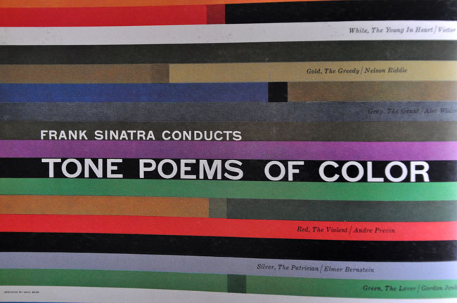
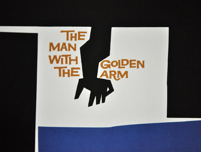
Of course, not all western covers shout. In fact, the past few decades have sheltered some astounding work. The iconic compositions of Chip Kidd, the art direction of John Gall, the illustrative touches of Grey318 or Ben Wiseman, the classic typography of Birdsall, and David Pearson’s and Peter Mendelsund’s beautiful series design.

These designers find ways to make exciting — through illustration or creative debossings or other hacks — a space that’s remained largely unchanged for a hundred years. Their covers occupy a point of convergence blending austerity, sensitivity, reverence for the text and, of course, marketing:5

David Pearson's cover for Camus
David Pearson's cover for Confucius
David Pearson's cover for Kublikhan

Chip Kidd’s hardcover work for Murakami Haruki’s Wind Up Bird Chronicle
Mendelsund's cover for Camus.

Peter Mendelsund’s series work for Camus
grey318's cover for Everything is Illuminated
grey318's cover for I'm OK
grey318's cover for Extremely Loud and Incredibly Close

Gray318 branding Foer

But covers like this are the exception.

Which begs the question — if so much of what book cover design has evolved into is largely a brick-and-mortar marketing tool, then what place does a ‘cover’ hold in digital books? Especially after you purchase it? But, more tellingly, even before you purchase it?
(…)
……………………………………………………………………………………………………………………………..


Read full essay Hack the Cover — by Craig Mod.

April 17, 2012
by Paco
0 comments

Das Design Revolution

reblogged from Das Design Revolution – Boxes and Arrows: The design behind the design.

Das Design Revolution,
by Stuart Neale on 19.03.2012.

Experience design comrades, I speak to you today because I have a vision. A vision where one day the person who really matters is back at the heart of our design processes. Rightfully claiming pride of place at the centre of all decisions regarding our websites, interfaces and systems. I am talking, of course, of the Designer, or more specifically, the Designer’s Portfolio.

For too long have we pandered to the user-centered orthodoxy at the expense of beautiful 1,200px wide images crafted for CSSgallery websites. How can we be expected to turn a small corner into a 400×300px snapshot that looks good on Dribble.com whilst having to worry about user personas? How can we expect Patterntap.com to accept our gorgeous, beveled navigation system if we have to spend time considering things like reassurance, orientation or SEO?

We are forced by project teams to worry incessantly about requirements: the user’s, the business’s or even, heaven forbid, the client’s. Our KPIs continually push us to sacrifice our design flourishes at the alter of ‘simplicity’ or even ‘usability’, whilst paying no heed to fulfilling our fundamental needs as frustrated Fine Artists or Filmmakers.

So in response to this I propose a new way of thinking about our practice. A revolution if you will. Set your iPhone lamp to ‘on’ and let it illuminate the darkness of agile prototyping methodology toward a shining new revelation:

Portfolio-Centered Design

“I’m with you!” you tweet, “but how can we blindly follow you with no manifesto?”. Fear not; using my own process I have carefully crafted a ten-point system (because ‘ten-point’ always sounds best, regardless of how many cogent points I can actually come up with) for a designer to keep in mind. Consider these a checklist that will help you achieve the pinnacle of a shining portfolio, and get that all important job in an interactive marketing agency, turning above-the-line advertising into social media campaigns.

1. First and foremost, context is nothing

For a designer to have to think about a portfolio that is anything more than a series of images accessed by menus of thumbnails is absurd and not worthy of consideration. After all, if it’s good enough for art galleries then why not for us? We have to remember that our designs are essentially a series of pictures: to be looked at, commented on and copied in a suitably reverential setting.

Only this way can they truly ‘breathe’ as we want them to. Only then can we see their true aura, stripped of superfluous information, context or brief. Only then can they be evaluated without reference to requirements or KPIs, changing digital landscapes or touchscreen shapes and sizes.

2. Don’t pay too much attention to testing

How can users meaningfully assess your designs? They might have no prior knowledge of the system. Surely the best-placed person to decide if a series of pages works is the person who designed them. It’s obvious that only they really know what each item means and are best placed to understand the design decisions behind it.

Too often do I hear designers overruled with questions about users’ comprehension. Too often have I heard arguments citing Cognitive Psychology. Too often have principles of human behaviour and capabilities trumped good, solid layout decisions.

If the designer has seen the problem solved by their favourite app on their iPhone, which was approved by Apple, then it must be the best process and the users will eventually just learn how to use the system.

3. You can never arrive at a solution too quickly

If you can re-write a brief with as many solutions upfront as possible, this will significantly cut down on research, iterations, and those frustrating workshops with the wider team, clients or users. You are not a business consultant and this approach will free you up for the important jobs, like deciding which Smashing Magazine social icon set best reflects current design trends.

This also allows you to fill the gaps in your portfolio. Missing an AJAX carousel? Seen a good example of one? Simply set up the brief so the project needs a carousel (there has to be an explanation for them existing).

Finally, that portfolio needs a current, on-trend solution? Simply find yourself one (preferably popularised by industry gurus) and retro-fit the project requirements later. You can have these two for nothing: embedded fonts or responsive design (will work for about another six months or so).

4. Content is not your job

We cannot be expected to be storytellers; it is not our job to guide people through our sites. This is the job of the content strategist or copywriter and can be done right at the end. Taxonomy, nomenclature and so on, these are simply not as important as getting the colour pallet nailed.

There is a great tradition of using dummy Latin text in advertising. So why not stick to it? It makes us look like our fledgling field has roots in an older and more accepted field like advertising layout.

5. Considerations of technology – somebody else’s job

Do not collaborate with programmers. Keep as far away as possible, do not let them stifle creativity. Only the ‘Creative’ team is really qualified to come up with UX solutions; they’re the ones who went to Art College after all. Maintain a good ‘over-the-fence’ relationship with the technical or engineering team, and none of their prototyping or agile methodology will get in the way of your blue-sky design thinking. This leads us neatly to –

6. Collaboration, not exactly a dirty word, but a bit icky

Again, advertising can be our paradigm here. Silos keep things simple. Strategy is best left to the strategy team, user research and engagement to the IA team, and so on. Demand polished wireframes (think ‘scamps’) to colour in.

Client management? You know where the account team is. Keep your engagement to carefully planned walkthroughs, making sure the number of solutions to be presented is pre-arranged so there are no surprises. If in doubt, just remember headphones can be a designer’s best friend.

7. Accessibility works best as an afterthought

This is what the principle of ‘degrade gracefully’ was invented for. Always design for the highest spec users. This allows you total creative freedom, unencumbered by limitations of contrast, plug-ins, browsers, user’s disabilities and so forth. It is self-evident that only this can produce the most creative design solutions.

Then simply allow the site to ‘degrade gracefully’ and everyone who doesn’t sign up to your setup can simply enjoy an experience more suited to their system, or their personal limitations.

8. Photoshop: let that be where responsibility ends

If you can fill your folio with the initial designs, it ultimately doesn’t matter to you how it turned out in the browser, or whether KPIs were achieved. Sticking to your goal of beautiful pictures above all else allows you to keep your involvement ring-fenced to the early phase of the project and avoid the difficult responsibilities later on.

This keeps you free to make sure you always have your ear to the ground for the next portfolio-worthy project to work-up in Photoshop and get onto your site.

9. Lorem ipsum dolor sit amet

Don’t be afraid of filler content to fit a nice pre-existing pattern. As I said ‘ten-point plan’ sounds better than ‘nine-point plan’. Whether the site experience works as a flow over multiple pages is not evident from portfolio grabs, so don’t worry, you are safe.

10. Don’t throw your net too wide

You’re crafting visual designs, so restrict your influences to that field. You can’t be expected to have time to absorb other mediums, have other interests or think about how they could relate to the problems we are trying to solve.

Your influences should come from within digital and possibly graphic design. What can film or games design teach you? Architecture is about buildings not websites. They are fundamentally different disciplines and will only confuse the design purity. Remember: “if it’s not Swiss, give it a miss.”

Keep all these in mind, and that award-winning portfolio could be yours!

Just don’t send it to me, that’s all I ask.


…………………………………………………………………………………………………………………………………

Just in case,  for those who by chance didn’t manage to cacht it…, this post  is a humorous satire.

April 9, 2012
by Paco
0 comments

Saul Bass: A Life in Film & Design

via Saul Bass: A Life in Film & Design | David Airey, graphic designer.

“…before we worked together, he was a legend in my eyes. His designs, for film titles and company logos and record albums and posters, defined an era.”

MARTIN SCORSESE

Saul Bass: A Life in Film & Design

Saul Bass: A Life in Film & Design is the first book to be dedicated to one of the greatest American designers of the twentieth century. Produced by Jennifer Bass Saul’s daughter and Pat Kirkham, and published by Laurence King, it’s a gem.

Saul Bass 1920-1996 created some of the most compelling images of American postwar visual culture. Having extended the remit of graphic design to include film titles, he went on to transform the genre. His best-known works include a series of unforgettable posters and title sequences for films such as Alfred Hitchcock’s Vertigo and Otto Preminger’s The Man with the Golden Arm and Anatomy of a Murder. He also created some of the most memorable logos and corporate identity campaigns of the century, including those for major companies such as AT&T, Quaker Oats, United Airlines, and Minolta.

Saul Bass: A Life in Film & Design

Saul Bass: A Life in Film & Design

Saul Bass: A Life in Film & Design

Saul Bass: A Life in Film & Design

Saul Bass: A Life in Film & Design

Saul Bass: A Life in Film & Design from Laurence King Publishing on Vimeo.

Reblogged  from  Saul Bass: A Life in Film & Design | David Airey, graphic designer.