Just Because: Tricycle Calligraphy 水书法器 from Jonah Kessel on Vimeo.
April 7, 2012 by Paco | 0 comments

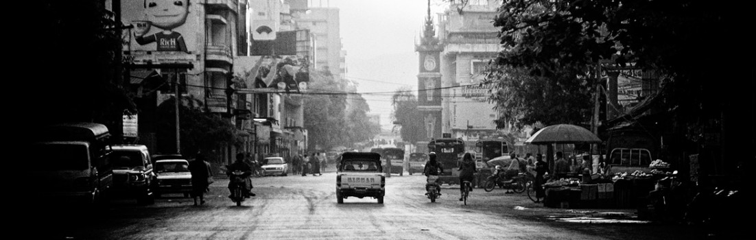
Early March, I went travelling to Myanmar(Burma) for a couple of weeks, definitely a very peculiar south-east asian country,and recently in the media for some well known reasons, a place that, above all, provides you more questions than answers.
Here you find the first set of shots, next incoming weeks I will be adding more images, hopefully.

")


This gallery contains 12 photos
April 7, 2012
by Paco
0 comments
April 7, 2012 by Paco | 0 comments


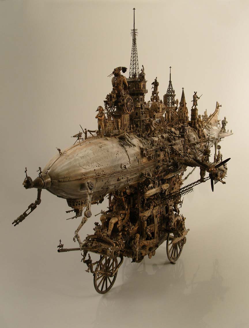


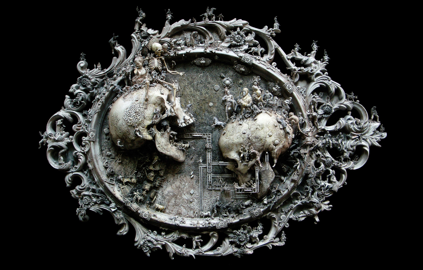
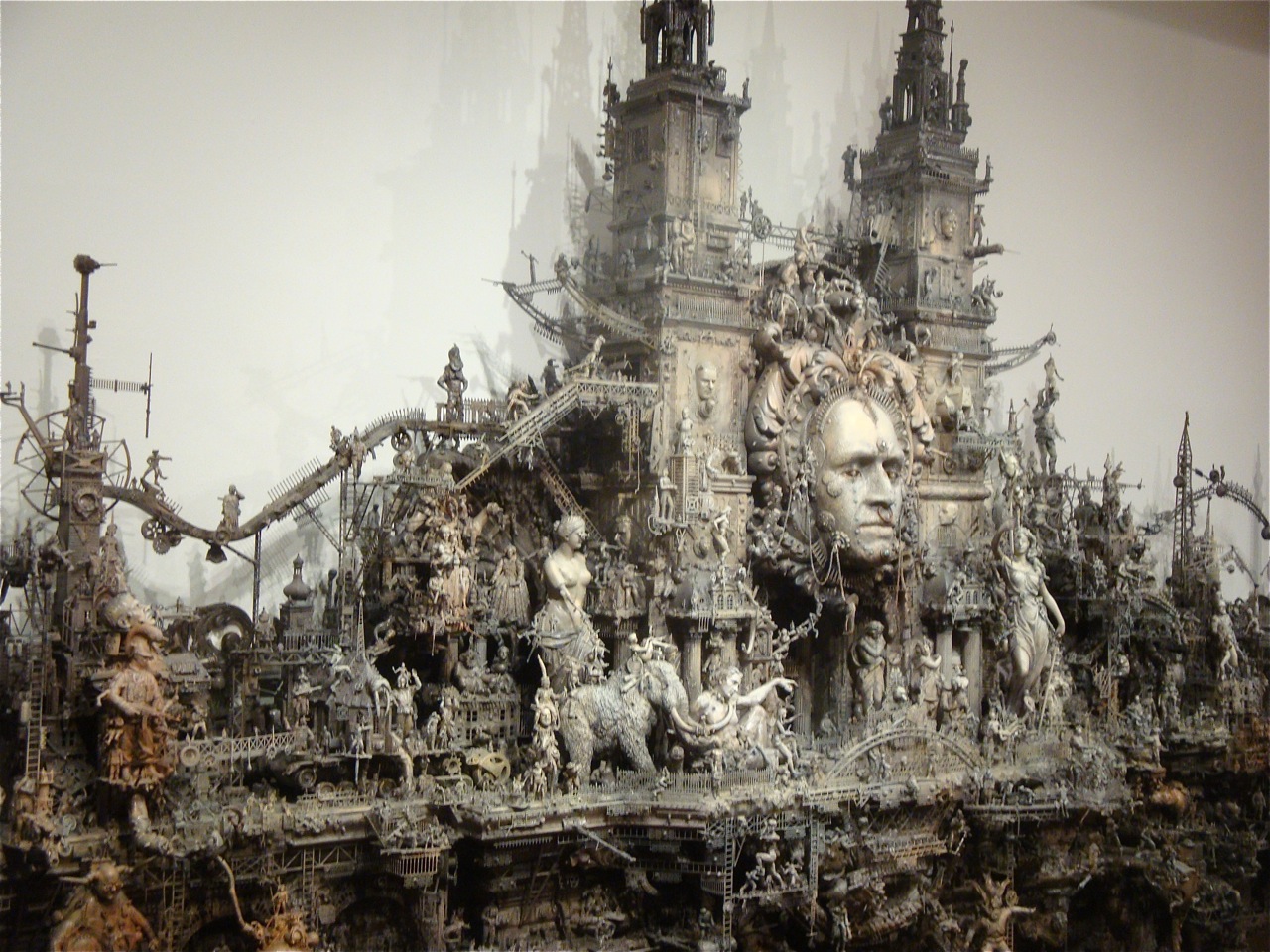


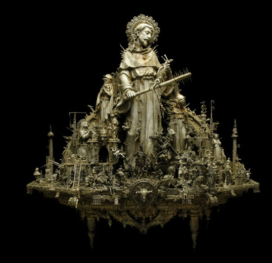
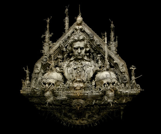
“A post-industrial Rococo master, Kris Kuksi obsessively arranges characters and architecture in asymmetric compositions with an exquisite sense of drama. Instead of stones and shells he uses screaming plastic soldiers, miniature engine blocks, towering spires and assorted debris to form his landscapes.
The political, spiritual and material conflict within these shrines is enacted under the calm gaze of remote deities and august statuary. Kuksi manages to evoke, at once, a sanctum and a mausoleum for our suffocated spirit.”
This gallery contains 0 photos
March 20, 2012
by Paco
0 comments
Defining the “T-Shaped Designer” January 27, 2011. By Dan Zollman.
While catching up on blog-reading, I came across Jack Moffett’s thoughts on the idea of the “T-shaped designer”. I began to write a comment, but after reviewing the articles he linked to one by Tim Brown, the other by Kevin McCullagh, I realized I had to take a step back.The metaphor of the T-shaped designer is the suggestion that a manager should want to hire a designer with great depth in one sense the vertical stroke of the T and breadth in another sense the horizontal stroke.But I realized that there are two very different ways of understanding this metaphor. First, Brown describes a designer with “deep analytical skills…but also broad empathy toward those other skills and disciplines encountered in business.” Similarly, Moffett describes the vertical stroke as a “specialization” and the horizontal as “a broader appreciation of the landscape in which the specialization fits.”However, McCullagh emphasized the word “generalist” in his explanation of breadth. This leans towards the version of the “T-shaped designer” that I’ve heard in lectures and talks elsewhere: in that version, the designer has depth in one domain but knows a little bit about every other domain.There is a small but important distinction between having empathy towards other disciplines and having skills in those disciplines. Empathy enables one to work alongside those disciplines, to understand their languages, to build upon ideas from those disciplines, and to succeed within the systems that bring those disciplines together. Having skills or knowledge in other disciplines can also enrich one’s own work, but this is different than having that empathy because technical skills and knowledge can be disconnected from their original disciplinary and professional contexts.If we stick with the T and, as Moffett suggests, the m metaphor, it is important to remember that this means going beyond breadth of skill and knowledge towards a broad understanding of the environments of design practice. A skill set based on “a little bit of everything,” while it always comes in handy, is decreasingly useful in specialized situations hence McCullagh’s concerns. But a good understanding of multiple disciplines themselves—which could even be achieved by developing practical skills to a greater depth—provides great flexibility, not to mention new ways of thinking about problems and systems.With that, I’ll return to my starting point. I like Moffett’s suggestion that the T shape should be followed by a second and a third vertical: the m shape. I would even take that a step further and say that we could replace the model of horizontals and verticals with a model that consists of many verticals of different lengths. Throughout my own life, I have moved between interests and hobbies, exploring them to different depths, at different rates, and at different times; in other words, my breadth is composed of a range of specialties growing together. I’ll make a cheesy comparison: accumulated experience is not the acreage of a garden but the plants in the garden, their number, their diversity, and their respective heights. So perhaps it would be productive and, in the context of schooling, happier to approach education not as a process of covering ground but as a process of growing a garden.
via Defining the “T-Shaped Designer” – Thinking Instead of the Box.
March 2, 2012
by Paco
0 comments
Posted on February 15, 2012 in Information Architecture, User Experience by Elisabeth Hubert .
When I was first introduced to the field of user experience it was the summer of 2005. After leaving my job as a Java Programmer in Hartford, CT I moved to San Antonio, TX where I randomly fell into a UX job (talk about lucky). It’s an understatement to say that I had no idea what the hell I was doing, and I scraped along for awhile trying to figure it all out. Back in those days, my role was not UX Designer or Interaction Designer, in fact, the term UX didn’t even exist in my world! Instead, those of us that weren’t visual designers were called Information Architects, and that was exactly what we did. It was our job to architect, organize and make sense of the information within a website or application. After we mapped that out (either in an IA doc or some sort of concept mapping), we worked with a visual designer to put our mapping into an interface.
Unlike a lot of what we see today, the first thing I did on the job was NOT learn how to wireframe. In fact I didn’t create my first wireframe until I moved back east to NYC almost three years later. Instead, the first thing I was instructed to do was visit Jesse James Garrett’s site. I was tasked with understanding what the Visual Vocabulary for describing information architecture and interaction design was from a conceptual standpoint, and was then expected to map out IAs for my projects. There are several reasons why this was my first step. Reason one was that we IAs and VDs simply needed to know how information was related and prioritized within a website or application before we could design the interface for that system. How else can you design a proper interface solution unless you understand which information types need to be included in that solution, and which are most important to the solution? Without knowing this information, we would have been guessing at the interface. Reason two was that we didn’t want to show an interface to our non-design partners and stakeholders as our first deliverable because what we really needed from them was not feedback on the visual, but feedback on the content and context that related to the system. It’s seven years later, and, sadly, it seems that the time I’m speaking of has come and gone. And, because of that we are facing a huge problem in the world of UX.
The problem UX is facing is, simply, we are devolving. The definition of de-evolution is to degenerate through a gradual change or evolution, and it seems to me that by removing the information architecture step from our day to day process we might be on that path. To be fair, I’m not saying how that IA phase should be structured in detail (that is for another post), but I am saying that this type of thinking needs to be done and signed off on by certain team partners before we can move into interface design (including wireframes).
We see several problems that come out of skipping the IA phase. First, the team (UXers, Visual Designers, Project team members, other stakeholders) won’t all be in agreement on the prioritization and context of the information to be designed for which will cause disagreement in later phases. Second, by showing wireframes without agreeing on IA, we are focusing our stakeholders and other partners on the interface and not on the real thing we are designing for… content and context. Third, we are, in essence, beginning to lie to ourselves. We are lying to ourselves by telling each other than UX is not just about form, but it is about function as well. Because if it was about function, we’d spend time on the information (the IA phase) before we went right into talking about the form that the information should take (the wireframe phase).
To make matters worse, we, as an industry, have been trying to validate the discomfort that many of us feel subconsciously with skipping the IA step, by turning to “sketching” as the end all be all answer. Of course, sketching is important, but it all matters what we are sketching and when. What I’m talking about is that we UXers think that since sketching doesn’t involve putting our wireframes into an electronic format, than it doesn’t really count as skipping straight to wireframing. But guess what, even sketching the interface without first sketching the structure of the information means you are skipping the one step that will make your designs truly successful. That step is where you think about the content, context and users, and force your stakeholders to do the same, WITHOUT thinking about the interface (also known as the IA step).
So where do we go from here? How do we stop this process of devolution and backwards movement? Well, we bring back IA! Ok, ok, I’m not saying that we should all learn Jesse James Garrett’s Visual Vocab (though it wouldn’t hurt) or that we need to institute a structured process that we follow the exact same way every time. But, what I am arguing we need to do is slow down, put down our sketching pens, and our omnigraffle and just think. Think about, draw out and get buy in on your content, your context, and your users. And do so without a wireframe or a sketch of a wireframe. Pick up the Polar Bear book, and ignore the wireframe chapter and learn IA.
By bringing the IA phase back and by concentrating first on the information, several things will happen. First, your sketching and interface design becomes much, much better because you have prioritization and buy off on the content, context, and users you are designing for. This means that your wireframe/prototyping phase becomes a lot more about the interface and not what content should go in the interface and why. Second, you are showing your stakeholders that UX design truly isn’t just form, but really is also about function. We are moving away from the interface, which is how we started, and towards a real solution of which the interface is only a part. Third, we stop lying to ourselves, and we stop saying that the best UX solutions aren’t just the coolest or the best aesthetically, but they are those that take content, context and users into consideration while creating an aesthetically appropriate interface. Most importantly we stop UX’s slide down the evolution scale back towards the time of print design and outputs, and instead continue our climb up the mountain towards being the user experience experts.
March 2, 2012
by Paco
0 comments
We’d like to hire you for our customer service department.It’s practically impossible to look at a penguin and feel angry.
A quote in Randy Glasbergen‘s Cartoon.
via Inspiring UX | Inspiring Good or Bad User Experience From Anywhere. A bit about life..
January 20, 2012
by Paco
0 comments
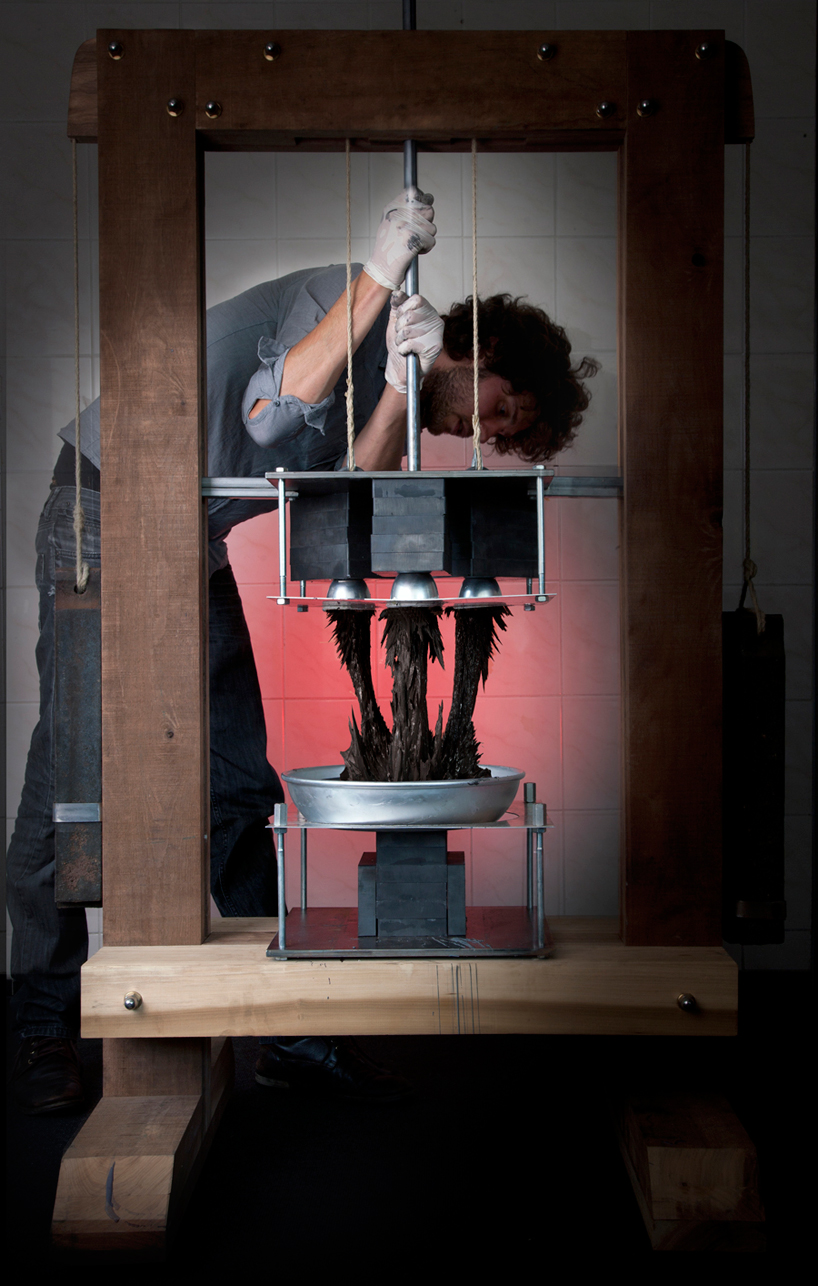


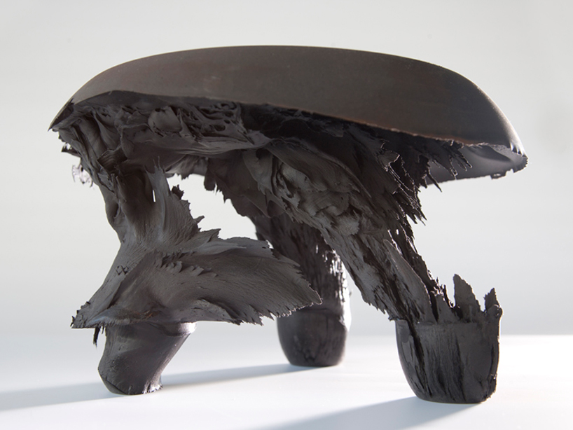
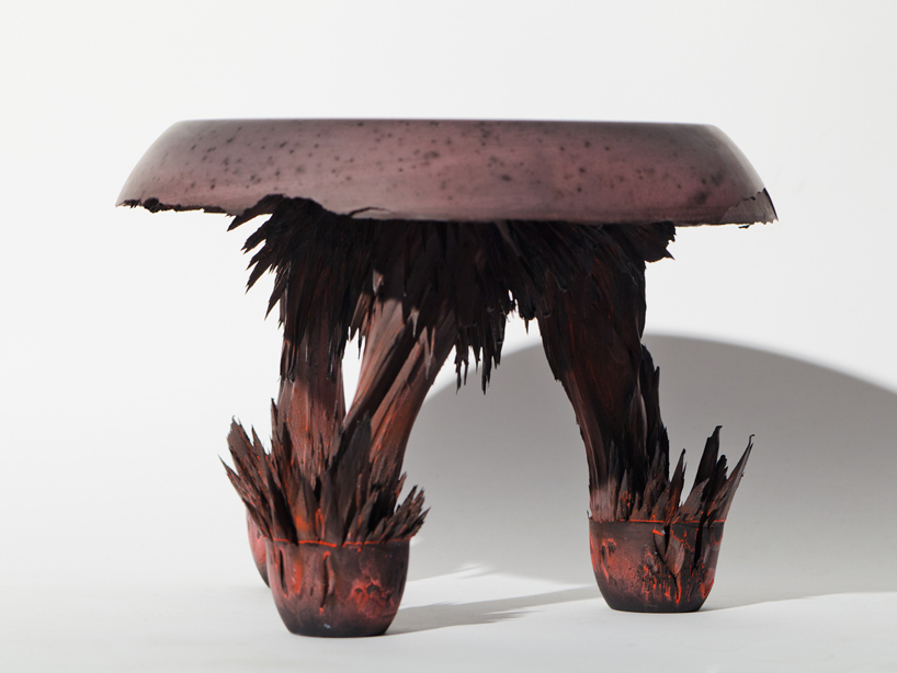
‘gravity stool’ by dutch designer jólan van der wiel is on show as part of imm cologne 2012‘s [D³] talents programme.
The project takes into consideration the laws of physics, departing from the idea that everything is influenced by gravitation.
for the series, van der wiel manipulates this natural phenomenon which has a strong shaping effect,
exploiting its own power: magnetism.
Via designboom.
Gravity Stool from Miranda Stet on Vimeo.
January 20, 2012
by Paco
0 comments
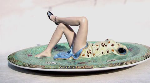
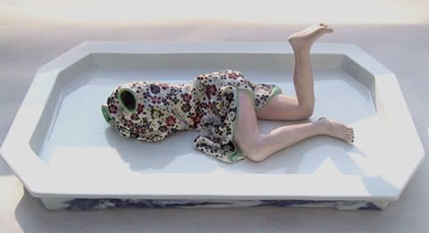
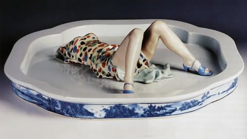
More about Liu Jianhua.
January 18, 2012
by Paco
0 comments
January 18, 2012
by Paco
0 comments


I love these sparkling and luminiferous works of Taiwanese photographer Wang Chien Yang , recently graduated from the National Taiwan University of Arts and his images (particularly those from his new project “House” as shown here) are so full of life and joy that it can only bring a big smile to your face.