


More about Thomas Doyle.
December 13, 2011
by Paco
0 comments
December 13, 2011
by Paco
0 comments
December 13, 2011
by Paco
0 comments
December 12, 2011
by Paco
0 comments
Reblogged from Sweet Station.

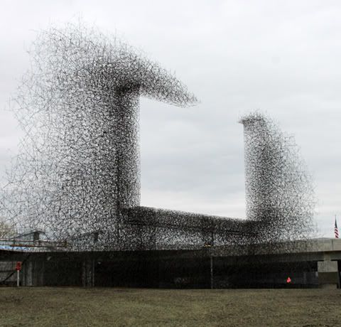
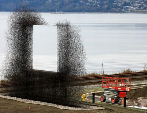
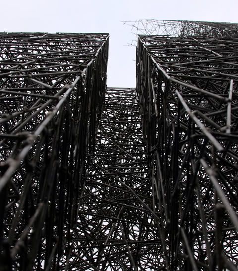
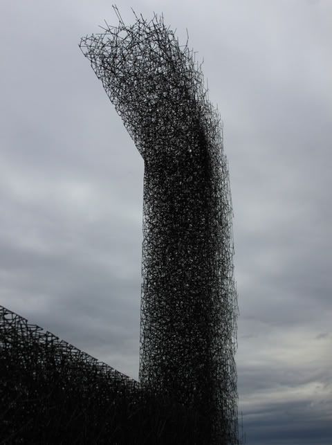
Non-Sign II is an installation by Seattle based Art collective Lead Pencil Studio located at the Canada-US border near Vancouver. The sculpture is made from small stainless steel rods that are assembled together to create the negative space of a billboard. While most billboards draw attention away from the landscape Non-Sign II frames the landscape, focusing attention back on it.
December 9, 2011
by Paco
0 comments
Reblogged from http://www.stepstoinnovation.com, Pedro Cubillo
The video speaks for itself.
A design must solve a problem. Always, otherwise, there is little motivation to use it.
There are various crucial points to make about this particular design, and represent the philosophy in which products, services, methods, etc. ought to be designed. Of course, the beauty of design is the diversity of philosophies, so please add your thoughts in the comments section.
First, it incorporates the recycling of waste in a brilliant way. Fantastic!
Second, it breaks a dependency. In this case, a dependency on electricity, and leverages natural resources. I want to stress the importance of breaking dependencies in design. In every design exercise, there will undoubtedly be dependencies of one form or another. When looking to build a design solution, the more dependencies that can be eliminated, the better, of course.
Third, it generates employment. Given that the product does not require highly skilled workers to assemble and install, it opens the door to higher participation, employment.
Fourth, its simplicity means that it can be assembled and installed pretty much anywhere, anytime, almost in minutes.
The downside? Of course, it only works during the day. But this is a BEAUTIFUL solution to a hugely complex problem. It is a brilliant first step and, in design, there’s always Version 2
December 6, 2011
by Paco
0 comments
December 6, 2011
by Paco
0 comments
December 6, 2011
by Paco
0 comments
The Division | Design and Direction. Simply wonderful
December 3, 2011
by Paco
0 comments
November 15, 2011 reblogged from David Gauquelin in beautiful bits – by the prezi design team.

A few days ago I’ve been to the SFMOMA to see an exhibition about Dieter Rams. It was amazing to finally see all these products for real, after having seen them so many times in pictures. As many designers, I admire Dieter Rams products and even though I’m not designing hardware products, his work has always been very inspiring to me. First of all because the design thinking behind all his works is very relevant to design software products too. His ten principles for good design for instance still make a lot of sense today, whatever kind of things you’re designing.

There’s something about the layout of the controls, the extreme attention to details and overall readability of the functions which is specifically inspiring for anyone designing UIs. Hierarchy is thoroughly used, see how main functions have bigger buttons for instance or how the composition of the control panel group sub-functionalities together or link related elements together by using precise alignments. All these things are in my head when I design an interface, because it’s about cognition, affordance – how do you perceive and understand a product at a glance, what to do, which button to use, etc. no matter if it’s on-screen or physical buttons.
My aim is to omit everything superfluous so that the essential is shown to the best possible advantage.
– Dieter Rams

And surprisingly, seeing all these objects together you can feel their true aesthetic quality, and this design approach, while being deeply functionalist, reveals an authentic, intrinsically beautiful industrial language. I had the following Paul Rand quote coming to my mind.

One quickly realizes that simplicity and geometry are the language of timelessness and universality.
– Paul Rand, “From Lascaux to Brooklyn”
Article originally appeared on beautiful bits – by the prezi design team (http://beautifulbits.prezi.com/).
December 3, 2011
by Paco
0 comments
Address Is Approximate from The Theory on Vimeo.

.jpg)
